Chance News 96
October 16, 2013 to December 20, 2013
Quotations
"The world is a messy place. The scientific method imposes some order, but in the case of climate change, that order is probabilistic. For the sake of science and the planet, we should not become distracted by a false sense of certitude. Imprecise truths are the most inconvenient ones."
Submitted by Bill Peterson
I am particularly fond of this example [the Linda problem] because I know that the [conjoint] statement is least probable, yet a little homunculus in my head continues to jump up and down, shouting at me—"but she can’t just be a bank teller; read the description.”
(See the discussion of the Linda Problem Item 6 below).
Submitted by Bill Peterson
“Once managers start asking themselves ‘what is this distribution?’ instead of ‘what is this number?’, they are in a position to use the various tools … for their own analysis. …. What is needed is a convenient way to pass distributions around… .”
Statistics and Public Policy (1997)
Submitted by Margaret Cibes
“The name MongoDB stems from ‘humongous database’, but chair and co-founder Dwight Merriman says there are more sizes and shapes to data than just ‘big’.”
Siliconrepublic, October 30, 2013
Submitted by Margaret Cibes
From The Big Short, by Michael Lewis, Norton, 2011:
"Above the roulette tables [at The Venetian in Las Vegas], screens listed the results of the most recent twenty spins of the wheel. Gamblers would see that it had come up black the past eight spins, marvel at the improbability, and feel in their bones that the tiny silver ball was now more likely to land on red. That was the reason the casino bothered to list the wheel’s most recent spins: to help gamblers to delude themselves. To give people the false confidence they needed to lay their chips on a roulette table. The entire food chain of intermediaries in the subprime mortgage market was duping itself with the same trick, using the foreshortened, statistically meaningless past to predict the future. " [p. 147]
"Craps offered the player the illusion of control – after all, he rolled the dice – and a surface complexity that masked its deeper idiocy. “For some reason, when these people are playing it they actually believe they have the power to make the dice work,” said [an analyst]. " [pp. 150-151]
Submitted by Margaret Cibes
Forsooth
“A somewhat comic, though not necessarily typical reaction to the use of sampling by a Federal agency occurred in 1936 when the National Resources Planning Board published its report Consumer Incomes in the United States, …. It showed a highly skewed distribution of income, with the top 10 per cent of the families and single individuals receiving 36 per cent of the income. …. [T]his was the first time that a Federal agency had published such data, and it was based on a sample. The U.S. Chamber of Commerce issued a blast against this report, which it considered it to be socialistic propaganda. It said that the estimates were based on ‘less than a 1 per cent sample, and a random sample at that!’”
cited by W. Allen Wallis, “Statistics in Washington, 1935-1945”
Statistics and Public Policy (1997)
"Only 18 percent of American adults can calculate how much a carpet will cost if they know the size of the room and the per yard price of the carpet, according to a federal survey."
Note: The online version was corrected on 9 December to read "per square yard price." Granted, the original mistake by itself would not have warranted a Forsooth. But in an essay about cultivating real-world problem-solving skills?
Submitted by Bill Peterson
"According to the World Bank, $1.3 billion in remittances is sent each year to Kenya, a process that costs about $110 million in fees. By using bitcoin’s peer-to-peer technology to avoid banks and wire-transfer companies like Western Union, BitPesa hopes to reduce these fees by a third, saving ordinary Africans $74 million annually."
(With that logic, they should try to reduce fees by only a tenth, which would save them $99 million a year.)
Submitted by David Streiner
Let's make an XKCD
Thanks to Brian Abend for sending a link to this cartoon from XKCD

The Monty Hall problem just won't stay solved, so it was only a matter of time before it was enshrined in XKCD. Here are two other recent appearances in the news:
- Stick or switch? Probability and the Monty Hall problem, BBC News Magazine, 11 September 2013
- “Readers’ Challenge report: The Monty Hall problem”, Significance, October 2013
Corrupt Ivy League admissions?
Writing last year, in the American Conservative (The myth of American meritocracy: How corrupt are Ivy League admissions?, 28 November 2012) Rob Unz claimed that today's Asian students were now being discriminated against in ways that Jewish students had been in the past. Namely, despite growing numbers in the population and impressive academic accomplishments, their share of the admissions to top institutions was being restricted by quotas. Furthermore, Unz went on to assert that Jewish students are now actually over-represented relative to equally qualified Asians and non-Jewish whites. Unz's article includes various statistical graphics to support these claims; for example, see

At the time of the article, a blog post by Andrew Gelman took the analysis at face value and asked, Should Harvard start admitting kids at random? (28 November 2012). Subsequently, however, Gelman and others were led to re-examine the Unz data, and found that many of the earlier claims do not stand up. For example, instead of inferring Jewishness via a family name, Janet Mertz actually contacted some of the individuals who were on the Math Olympiad team. She writes here that
The actual count of Jews is at least 10¼ out of 78 (counting part-Jews fractionally), i.e., 5-fold higher [than Unz's claim of only two ]. When an author refuses to admit to an error about which there is no possibility he is correct, academics have no choice but to then question the validity of everything that author has ever written because they can no longer trust the veracity of his statements.
Most recently, in a post entitled Ivy Jew update (22 October 2013), Gelman quotes Nurit Baytch:
Unz’s conclusion that Jews are over-admitted to Harvard was erroneous, as he relied on faulty assumptions and spurious data: Unz substantially overestimated the percentage of Jews at Harvard while grossly underestimating the percentage of Jews among high academic achievers.
This latest post by Gelman has a number of interesting quotations, that are worth bearing in mind when looking at any statistical claim:
- "My take on all this is that it can be harder than it looks to do research using statistics."
- "It’s perfectly natural to get excited when one’s initial hypothesis is confirmed by an examination of some data, but the next step is to recognize that these exciting discoveries do not always hold up."
Regarding the particular analysis in question, he writes
Unz, who spends so much of his time in the political arena, is used to politically-motivated criticisms and responds in kind, and so I think he sees the statistics provided by Mertz and Baytch as attacks to be dodged or parried rather than as useful information that can help him modify his understanding of the world. But for those of us how are not so invested in a particular position, Baytch’s article, and Mertz’s from a few months ago, should be helpful to anyone interested in further study of ethnicity and high-end college admissions.
In a related post, My beef with Brooks: the alternative to “good statistics” is not “no statistics,” it’s “bad statistics” (20 February 2013), Gelman takes columnist David Brooks to task for adopting an "anti-data" posture in a NYT column. He observes that Brooks had been happy to quote the Unz analysis in a column two months earlier. According to Gelman, "Janet Mertz contacted him [Brooks] and the Times to report that his published numbers were in error, and I also contacted Brooks (both directly and through an intermediary). But no correction has appeared."
Submitted by Paul Alper
Dance of the p-values
Paul Alper sent a link to a wonderful YouTube video, Dance of the p-values. This is an animated simulation--with sound effects keyed to emotional responses--designed to show how erratically the p-value can vary in replications of the same experiment.
Paul found it through Andrew Gelman's blog (7 November) which also features this cartoon:

There was a spirited discussion of p-values on the Isolated Statisticians e-mail list this fall, in the course of which Doug Andrews sent the following quote from the master himself,
In the investigation of living beings by biological methods statistical tests of significance are essential. Their function is to prevent us being deceived by accidental occurrences, due not to the causes we wish to study, or are trying to detect, but to a combination of the many other circumstances which we cannot control. An observation is judged significant, if it would rarely have been produced, in the absence of a real cause of the kind we are seeking. It is a common practice to judge a result significant, if it is of such a magnitude that it would have been produced by chance not more frequently than once in twenty trials. This is an arbitrary, but convenient, level of significance for the practical investigator, but it does not mean that he allows himself to be deceived once in every twenty experiments. The test of significance only tells him what to ignore, namely all experiments in which significant results are not obtained. He should only claim that a phenomenon is experimentally demonstrable when he knows how to design an experiment so that it will rarely fail to give a significant result. Consequently, isolated significant results which he does not know how to reproduce are left in suspense pending further investigation.
R.A. Fisher, in: “The Statistical Method in Psychical Research,” Proceedings of the Society for Psychical Research, 39, 189-191 (1929)
The Linda Problem
Kahneman and Tversky's "Linda Problem" is a famous illustration of the conjuction fallacy:
Linda is 31 years old, single, outspoken, and very bright. She majored in philosophy. As a student, she was deeply concerned with issues of discrimination and social justice, and also participated in anti-nuclear demonstrations. Which is of the following is more probable?
- Linda is a bank teller.
- Linda is a bank teller and is active in the feminist movement.
From a formal logic perspective, the answer is obviously the first. Yet many people, because of the information about Linda's behavior and outlook on life, choose the second. In his book Gut Feelings: The Intelligence of the Unconscious, Gerd Gigerenzer points out that the reason for the confusion about the conjunction "and" is that natural language does not work the way of logic. His first example to illustrate the discrepancy is
- Peggy and Paul married and Peggy became pregnant.
- Peggy became pregnant and Peggy and Paul married.
His second example is
- Mark got angry and Mary left.
- Mary left and Mark got angry.
Obviously, either of the above violates Prob (A and B) = Prob (B and A). The following does not violate Prob (A and B) = Prob (B and A):
- Verona is in Italy and Valencia is in Spain.
- Valencia is in Spain and Verona is in Italy.
Further,
Even more surprising, we also know without thinking when AND should be interpreted as the logical [inclusive] OR, as in the sentence:
- We invited friends and colleagues.
See the VA AG election story below for an up-to-date example of AND meaning OR.
One of Gigerenzer's continuing themes is that instead of probability we should concentrate on frequency, which is much easier to understand. He would rephrase Linda to
There are a hundred persons who fit the description above (i.e., Linda's). How many of them are
- bank tellers?
- bank tellers and active in the feminist movement?
His empirical claim is that people easily figure things out with this rephrasing.
A Chance News item from a few years back discussed John Allen Paulos's take on the Linda Problem, from his NYT article "Stories and Statistics."
Submitted by Paul Alper
Flaws in cholesterol risk calculator?
Risk calculator for cholesterol appears flawed
by Gina Kolata, New York Times, 17 November 2013
The article includes an online graphic summarizing the findings:

For commentary on a related story, see the post The Economics & Politics of Drugs for Mild Hypertension from HealthNewsReview.org (4 November 2013), which begins
The Cochrane Collaboration’s Hypertension Group published a systematic review of drug treatment for mild hypertension in August 2012 showing no evidence that drugs benefit patients while about 11% have side effects severe enough to stop treatment. As coauthor of that review, I [Dr. David Cundiff] will comment on the economics, politics, regulatory intrigue, financial conflicts, and subsequent media coverage involved.
Submitted by Paul Alper
Updates
Bumps in the road to new cholesterol guidelines
by Gina Kolata, New York Times, 25 November 2013
Statins by numbers
by Jason Karlawish, New York Times, 29 November 2013
Karlawish is a professor of medicine at the University of Pennsylvania. In one passage, he writes:
What is the problem with grounding medical practice in the cold logic of numbers? In theory, nothing. But in practice, as decades of work in fields like behavioral economics have shown, people — patients and doctors alike — often have a hard time making sense of quantified risks. Douglas B. White, a researcher at the University of Pittsburgh, has shown that the family members of seriously ill patients, when presented with dire prognoses, typically offer quite variable understandings not only of qualitative terms such as “extremely likely” but also of quantitative terms such as “5 percent.” We like our numbers, but despite our desire for better information and an ethic of “informed consent,” we don’t know how to use them.
Update on International Year of Statistics
Allie Weinstein provided a newspaper clipping of the following:
Odds lot: Statisticians party like it's 2.013 x 10 cubed
by Daniel Michaels Wall Street Journal, 15 November 2013
The article reports that, now 88% through the International Year of Statistics, the event is viewed as success. It repeats the famous claim, made in 2009 by Google's Hal Varian , that statistics would be "the sexy job in the next 10 years."
The online article links to these YouTube clips from the Statistics2013 video contest:
- A Day Without Statistics, from the Research Center for Statistics of the University of Geneva
- My Statistician Friend, by Gianluca Massimo
- Stats Can Be Cool, You See, by Prof. Michael Posner of Villanova University
- Why Statistics Matters?
Nuts and death
Go nuts! Consumption of nuts linked to mortality benefit
by Larry Husten, (contributing medical news journalist), Forbes, 20 November, 2013
As described here, "Nut consumption has long been linked to healthy lifestyles. Now, a study in the New England Journal of Medicine extends the finding and demonstrates a strong association with improved mortality."
The study referred to here is:
- Association of nut consumption with total and cause-specific mortality
- by Ying Bao, M.D., et al, New England Journal of Medicine, 369:2001-2011, 21 November, 2013
An interesting feature on the NEJM website is this 3-minute video description of the study (from which we borrowed the title above!). It does an excellent job summarizing the analysis in nontechnical language.
Submitted by Paul Alper
Knitting needle conversion
Paul Alper sent a link to this table which gives conversions for sizes of knitting needles:
- 
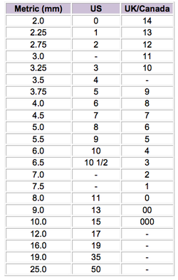

Paul observes, "The U.S. designation increases as the diameter goes up while the Canadian goes down. To add to the mystery, the sum of the U.S. and the Canadian adds to 14. Mostly."
For an intro class, it might be an interesting exercise to plot these data to see if any transformation can reconcile things. (Mostly!)
Plotting political ideology
The center cannot hold
by Thomas Edsall, New York Times, 4 December 2012
It's not everyday you encounter a scatterplot in the New York Times. In this column, Edsall presents this plot of political ideology of the 2012 electorate

The idea here was to give a more nuanced breakdown than the usual liberal/moderate/conservative, and show that identifying a moderate center coalition may not be as simple as just lopping off the extremes. The original analysis was based on data from the American National Election Studies website.
But one reaction from a NYT reader noted that:
These authors seem a bit too comfortable with their five categories,
particularly given that "complexity and seeming contradiction is [sic] the rule." That's a red flag that the analytical framework does not fit the underlying reality very well.
Discussion
Other than the shaded gray area in the middle, this looks like a picture of r = 0 (or very slightly positive). What do you make of this plot?
Submitted by Bill Peterson
Human factor in investing
“Losing My Religion”
by Samuel Lee, Morningstar, December 3, 2013
The author discusses how many academics, and their investor-followers, continue to adhere to the “elegant” theoretical “efficient-market hypothesis,” without taking into account the potential effects of “momentum” – investor behavior that may be excessively optimistic/pessimistic – on fund behavior, even in the face of evidence to the contrary.
I’m a slow learner. It took me a while to realize that the sophistication of a study had little to do with its merit. I clued onto this when I began reading the work of John Ioannidis …, who published an influential 2005 paper[1] that argued most published findings are bound to be false. …. His argument is sensible. Publications tend to look for positive results … and ignore negative results. …. I’ve learned to not be overly impressed with a single study or even a series of studies, no matter how credentialed the authors. The data can be tortured to confess to anything. You need to apply liberal doses of common sense—more when the claims are outlandish. A new theory has to be backed by many independent sources of data, ideally data the theory’s originators have never seen, and you need to really kick the tires of any assumptions it makes. …. Risk manager Aaron Brown argues many finance academics would never bet money on their more arcane models—such models are optimized for publication, to show how clever you are, not optimized to say something true about the world.
He describes a 1984 debate between a Rochester professor and Warren Buffet. The professor maintained that the literature had contained no examples of statistically significant skill in investing and described the fund industry as a coin-flipping game, in which someone will experience a long streak of successes given enough flippers. Buffet responded:
[I]magine a national coin-flipping competition with all 225 million Americans. Each morning the participants call out heads or tails. If they’re wrong, they drop out. After 20 days 215 coin-flippers will have called 20 coin flips in a row—literally a one in a million phenomenon for each individual flipper, but an expected outcome given the number of participants. [W]hat if 40 of those coin-flippers came from one place, say, Omaha? That’s no chance. Something’s going on there.
The author concludes, “But the ultimate test of a theory isn’t how credentialed its proponents are or whether it’s published in a prestigious journal, it’s this: Does it have predictive power?”
Submitted by Margaret Cibes
Peer review
“Peer Review”
Nature, December 2006
“Who’s Afraid of Peer Review”
by John Bohannon, Science, October 2013
In the Nature issue, editors describe their trial of an open peer review process, which they started in June 2006, and provide 22 articles solicited from some leading scientists, publishers and others about aspects of the process.
In the Science article, Bohannon describes a “sting” operation in which he submitted to 304 open-access journals a “fatally flawed” paper (actually multiple versions) he had written under a pseudonym (with a pseudonym-ous university affiliation). Apparently, 157 of these journals accepted the paper, 98 rejected it, and the others either did not exist anymore or had not decided. One accepting journal’s focus was totally unrelated to his topic; another’s charge for publication was $3100.
He cites Jeffrey Beall, a University of Colorado library scientist, who has an Internet page that names “predatory” publishers. See “Beall’s List of Predatory Publishers 2013” for his criteria and his list of more than 200 open-access journals.
Submitted by Margaret Cibes
Take a walk (briskly)
Douglas Rogers, who sent a link to the following, noting that it is of interest both on account of how statistical analysis is presented in the article, and for the comments on statistical methods.
Why a brisk walk is better
by Getchen Reynolds, Well blog, New York Times, 4 December 2013
This post describes a study entitled "The relationship of walking Intensity to total and cause-specific mortality. Results from the National Walkers’ Health study," which appeared last month at PLOS ONE.
Virginia AG election
VA changes vote count rules while counting (YouTube video)
The Rachel Maddow Show, 11 November 2013
The Virginia Attorney General contest this fall was exceptionally close. Democrat Mark Herring led Republican Mark D. Obenshain by 165 votes out of some 2.2 million. Even more amazing than just the numbers, is that the discussion seemed to turn on the (mis)interpretation of a Venn diagram! Starting around 14:50 mark in the video you will hear that for Fairfax County--which is heavily Democratic-- and only for Fairfax County, the State Board of Elections suddenly said that provisional ballots should be counted only if the voter and their representative are present whereas in all previous elections, the interpretation by Fairfax County officials was that provisional ballots would be counted if either the voter or their representative is present.
Updates
Herring wins Virginia attorney general race, elections board announces
by Laura Vozzella, Washington Post, 25 November 2013
In the weeks since the election, the lead has swung back and forth between the two candidates, as election officials sorted throught various re-tallies and certification processes. We read, "The most significant discovery came in Fairfax County, Virginia’s largest jurisdiction, where officials discovered nearly 2,000 uncounted ballots on a single optical-scan voting machine...In a typical year, these additions and subtractions don’t affect the outcome. This year, the contest for attorney general was so close that the normal process of fixing errors and counting provisional ballots caused the results tally to narrow dramatically in an already close race."
Obenshain concedes Virginia attorney general’s race to Herring
by Laura Vozzella and Ben Pershing, Washington Post, 18 December 2013
Obenshain's concession "allowed Herring to claim victory for the third time since Nov. 5 in a contest that on election night was the closest statewide race in Virginia history."
Submitted by Paul Alper