Chance News 92
Quotations
"I've done the calculation and your chances of winning the lottery are identical whether you play or not."
Suggested by Naomi Neff (with thanks to Cynthia Slater)
"As much as it pleases me to see statistical data introduced in the Supreme Court, the act of citing statistical factoids is not the same thing as drawing sound inferences from them."
Submitted by Paul Alper
“economisting … 1. The act or process of converting limited evidence into grand claims by means of punning, multiplicity of meaning, and over-reaching. 2. The belief or practice that empirical evidence can only confirm and never disconfirm a favored theory. 3. Conclusions that are theory-driven, not evidence-based.”
quoted by Edward Tufte in his Beautiful Evidence, Graphics Press, 2006
Submitted by Margaret Cibes
Forsooth
“The quants have arrived at the Academy [of Motion Picture Arts and Sciences]. …. The goals in making ... predictions extend beyond [Oscar night]. Dr. Rothschild [Microsoft Research economist] is testing whether surveying people online about Oscar patterns—for example, does winning best-adapted screenplay correspond with winning best picture?—is a method that can be translated to forecasting in other areas. If it works, ‘We can apply it to all sorts of other things we don't have data for,’ Dr. Rothschild said."
by Carl Bialik, The Wall Street Journal, February 23, 2013
Submitted by Margaret Cibes
Simpson’s paradox and the ecological fallacy
The lay public tends to believe that statistics is merely a (rather dull) branch of mathematics. In fact, the discipline of statistics should be viewed as a science, as exemplified by physics, astronomy, chemistry, etc., which uses mathematics extensively and is situation dependent. In other word, the same numbers lead to different conclusion depending on the context.
Prime examples of situation dependency may be found in the discussions of Simpson’s paradox and the even more subtle phenomenon known as the ecological fallacy. A treatment of the former can sometimes be found in elementary statistics textbooks but the latter, being less intuitive, is relatively rare in textbooks but often pops up in learned discussions where the reader is warned about drawing false conclusions.
The dating of the phenomenon now known as Simpson’s paradox goes back before any of the current Chance News readers were born; the bestowing of the name, according to Wikipedia, originated much later in 1971:
Simpson's paradox (or the Yule–Simpson effect) is a paradox in which a trend [i.e., inequality] that appears in different groups of data disappears when these groups are combined, and the reverse trend [i.e., opposite inequality] appears for the aggregate data. This result is often encountered in social-science and medical-science statistics, and is particularly confounding when frequency data are unduly given causal interpretations.
The Wikipedia article has this “real-life example from a medical study comparing the success rates of two treatments for kidney stones.”
| Treatment A | Treatment B | |
|---|---|---|
| Small Stones | Group 1 93% (81/87) |
Group 2 87% (234/270) |
| Large Stones | Group 3 73% (192/263) |
Group 4 69% (55/80) |
| Both | 78% (273/350) | 83% (289/350) |
The paradoxical conclusion is that treatment A is more effective when used on small stones, [93% > 87%] and also when used on large stones, [73% > 69%] yet treatment B is more effective when considering both sizes at the same time [78% < 83%]. In this example, the "lurking" variable (or confounding variable) of the stone size was not previously known to be important until its effects were included.
In this context of kidney stones, it is clear that disaggregation makes sense and Treatment A is preferable to Treatment B despite Treatment B being better in the aggregate sense. However, if we take the same numbers but change the context to Athletic Team A and Athletic Team B who play Small and Large opponents and the only thing that determines ranking is the total winning percentage, then Athletic Team B is preferred to Athletic Team A. That is, aggregation makes sense in this scenario as it did not in the original Wikipedia presentation.
Other interesting examples are provided in the Wikipedia article. When money is at stake, as in the “Berkeley gender bias” case discussed in Wikipedia, finding a lurking (confounding) variable requires some clever slicing to find “Small” and “Large” which will reverse the inequality. The Wikipedia article also refers to the so-called “low birth rate paradox” whereby “it has been observed that babies of low birth weights born to smoking mothers have a lower mortality rate than the babies of low birth weights of non-smokers.” The paradoxical implication is that smoking helps to lower mortality of newborns. More on this below.
A different Wikipedia article has two definitions of the ecological fallacy. The first definition focuses on aggregation and disaggregation. With this definition, Simpson’s paradox is subsumed under the ecological fallacy:
An ecological fallacy (or ecological inference fallacy) is a logical fallacy in the interpretation of statistical data where inferences about the nature of individuals [disaggregation] are deduced from inference for the group [aggregation] to which those individuals belong.
The second definition spotlights the notion of correlation:
Ecological fallacy can refer to the following statistical fallacy: the correlation between individual variables is deduced from the correlation of the variables collected for the group to which those individuals belong.
Although elementary statistics textbooks do not customarily mention the ecological fallacy, it is even older than Simpson’s paradox. The term was first coined in 1950 by William Robinson but goes back to Emile Durkheim’s 1897 study of suicide. From the graph, it appears that the greater the proportion of Protestants, the greater is the suicide rate:

According to Morgenstern, the estimated rate ratio of 7.6 was probably not because suicide rates were nearly 8 fold higher in Protestants than in non-Protestants. Rather, because none of the regions was entirely Protestant or non-Protestant, it may have been non-Protestants (primarily Catholics) who were committing suicide in predominantly Protestant provinces. It is plausible that members of a religious minority might have been more likely to commit suicide than were members of the majority. Living in a predominantly Protestant area had a contextual effect on suicide risk among Catholics.
Interestingly, Morgenstern points out that Durkheim compared the suicide rates at the individual level for Protestants, Catholics and Jews living in Prussia, and from his data, the rate was about twice as great in Protestants as in other religious groups. Thus, when the rate ratios are compared (2 vs 8), there appears to be substantial ecological bias using the aggregate level data.
In the above situation there was no reversal of an inequality, merely a sharp diminishing from aggregated to disaggregated. The following example of the ecological fallacy actually illustrates the reversal.
One compelling example by Robinson (1950), was the relationship between nativity (foreign vs native born) and literacy. For each of the 48 states in the USA of 1930, [there were only 48 states admitted to the Union by 1930] Robinson computed two numbers: the percent of the population who were foreign-born (i.e. immigrants), and the percent who were literate. He found the correlation between the 48 pairs of numbers was .53. This ecological correlation suggested a positive association between foreign birth and literacy: the foreign-born (immigrants) are more likely to be literate than the native-born. In reality, the association was negative: the correlation computed at the individual level was −0.11 (immigrants were less literate than native citizens). The ecological correlation gave the incorrect inference. This is because the foreign-born (immigrants) tended to migrate to and settle in states where the native-born are relatively literate. In this example by Robinson, the correlation is totally reversed.
Robinson’s data look this way:

The following graph dealing this time with income and being foreign born is even more striking:

U.S. states with proportionally more immigrants have proportionally more households with income above $100k. Ergo, immigrants are more likely than non-immigrants to have household incomes above $100k.
Hopefully something feels off about that logic. Because it’s wrong. Actually the relationship between income and being an immigrant at the individual level is the opposite.
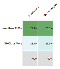
Deducing from the first chart that immigrants are more likely to be well-off is committing the ecological fallacy—attributing qualities at the individual level because of a relationship at a group level.

But here is a more recent and more difficult-to-unravel ecological fallacy:
That example was pretty easy to catch, not least because it feels intuitive that immigrants would tend to have lower income than non-immigrants.
But not all ecological fallacies are so easy to spot. For example, there’s a negative correlation between per capita income in a state and the percent of the 2012 presidential election vote that went to Romney.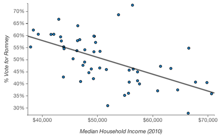
It’s easy to picture rich and liberal cities like San Francisco and New York, hear the phrase “latte liberal” a couple times, and believe that higher income is in fact correlated with voting Democratic. At an individual level, though, higher income is associated with voting Republican.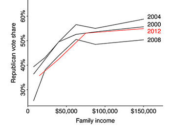
The (simplified) explanation for this apparent paradox? Across the country, lower income folk tend to vote Democrat; within blue states, upper income folk also vote Democrat, but in red states they vote Republican.


A general way to look at where the fallacy might arise is via the following graph and explanation of Durkheim’s suicide data:

That is, within every group it is possible that even if the correlation (regression line) is negative, it can happen that across the groups, the correlation (regression line) is positive. Note too that in many situations the “within” is not a cloud of points, each of which represents an individual, but instead, there is just one point, average exposure and average outcome. Further, exposure may come from one data base and outcome from another data base. This is totally unlike the kidney stones example which began this wiki because there stone and success can be tied to a particular individual.
Discussion
1. An oft-used synonym for the ecological fallacy (inferring from group to individuals) is called cross level inference. The opposite of the ecological fallacy is the atomistic fallacy (inferring from the individuals to the group).
2. With regard to Robinson’s data, besides the fallacy aspect, what is wrong with doing a correlation in the first place?
3. Concerning the graph of foreign born and income, suppose the ordinates were interchanged. How is this then similar to Durkheim’s study and its ecological fallacy?
4. The paradox of the smoking mother is supposedly explained by the following:
The birth weight distribution for children of smoking mothers is shifted to lower weights by their mothers' actions. Therefore, otherwise healthy babies (who would weigh more if it were not for the fact their mother smoked) are born underweight. They have a lower mortality rate than children who have other medical reasons why they are born underweight, regardless of the fact their mother does not smoke. In short, smoking may be harmful in that it contributes to low birth weight, but other causes of low birth weight are generally more harmful only with regard to their weight.
How does this explanation accord with the aforementioned phrase, situation dependent?
Submitted by Paul Alper
Normal vs. paranormal
John Allen Paulos sent a link to the following cartoon, reproduced below as presented on the StackExchange blog Cross Validated:

From: A visual comparison of normal and paranormal distributions
Matthew Freeman J Epidemiol Community Health 2006;60:6.
Lower caption says 'Paranormal Distribution'- no idea why the graphical artifact is occuring.
Gallup reviewing its methods
“Gallup Presidential Poll: How Did Brand-Name Firm Blow Election?”
HuffPost Pollster, March 8, 2013
The article discusses Gallup’s consistently favorable-to-Romney poll results over the Fall 2012 presidential election cycle, including a final Romney 49%-Obama 48% result. (Of course, 49 to 48 does not a winning prediction make.) It includes a nice scatterplot illustrating that the Gallup results deviated remarkably (not necessarily “significantly”) from other national polls over this period.
Apparently Gallup revised its methodology re presidential approval polling in October 2012, in order to correct an “under-representation of non-whites in its samples.” Another nice scatterplot shows how Gallup’s rating results moved more into line with other polls’ results in October of the period July 2012-January 2013.
The article also contains a somewhat detailed discussion of two serious problems facing Gallup and other pollsters today: “how they treat their ‘likely voter’ models and how they draw their samples from the general population.” These are issues associated with identifying likely voters and with reaching them by phone.
Submitted by Margaret Cibes
Naked Statistics
Charles Wheelan’s book, Naked Statistics: Stripping the Dread from the Data, is a breezy fun-filled read, his “homage to an earlier W.W. Norton classic, How to Lie with Statistics by Daryll Huff. Without my wishing to imply anything negative, a few decades back, Naked Statistics would be an ideal text for a course entitled, “Statistics for Poets.” Today, even poets, drama students, and people whose specialty is 17th century French drama (perhaps unfortunately) really need to learn some basic statistics. From the very Introduction to the book, he emphasizes his distaste for mathematics for mathematics sake: “What is the area beneath a parabola? Who Cares?” Yet, he likes physics which uses the same math “Because physics has a clear purpose.” Likewise, “I love statistics,” a comment not often seen or heard outside of Chance News.
As he puts it
The paradox of statistics is that they are everywhere--from batting averages to presidential polls--but the discipline itself has a reputation for being uninteresting and inaccessible. Many statistics books and classes are overly laden with math and jargon. Believe me, the technical details are crucial (and interesting)--but it’s just Greek if you don’t understand the intuition. And you may not even care about the intuition if you’re not convinced that there is any reason to learn it. Every chapter in this book promises to answer the basic question that I asked (to no effect) of my high school calculus teacher: What is the point of this?
The point is that statistics helps process data, which is really just a fancy name for information.
His motto is “Statistics can be really interesting, and most of it isn’t that difficult.” By the end of the book the reader is confronting regression analysis, which he calls “the miracle elixir, and in the next chapter, why it may not be. His examples vary from the amusingly bizarre to the downright practical. Naked Statistics is an ideal gift to a significant other who loves you but wonders about what you actually do with your time.
Discussion
1. On page xii he reveals “a career epiphany” he had at math camp. The math teacher was describing without any physical context that the infinite (geometric) series 1+1/2 + 1/4 + 1/8 +…converges to a finite number. Wheelan came up with the following context to make it meaningful to him: A wall is two feet away and your first move is one foot, followed by a move of 1/2 foot, followed by a move of 1/4 foot and so on until you are “pretty darn close to the wall.” What would happen to you and the wall if the infinite series was instead 1+1/2 + 1/3 +1/4 + 1/5 +1/6 + 1/7 +1/8 +…?
2. Nate Silver’s book, The Signal and the Noise, is a hymn to Bayesian statistics. ‘’Naked Statistics’’ has no mention whatever of Bayes or Silver so that your significant other will have to do some outside reading. Wheelan promises that his second edition will include Bayesian concepts.
3. The review in the NYT put it this way:
While a great measure of the book’s appeal comes from Mr. Wheelan’s fluent style — a natural comedian, he is truly the Dave Barry of the coin toss set — the rest comes from his multiple real world examples illustrating exactly why even the most reluctant mathophobe is well advised to achieve a personal understanding of the statistical underpinnings of life, whether that individual is watching football on the couch, picking a school for the children or jiggling anxiously in a hospital admitting office.
Are you a fan of those handy ranking systems based on performance data, guaranteed to steer you to the best surgeons in town? If so, you are up to your armpits in descriptive statistics, and Mr. Wheelan has some advice for you: beware. The easiest way for doctors to game those numbers is by avoiding the sickest patients.
How do college football and basketball teams similarly game the numbers?
4. At the same NYT review there is an accompanying graphic taken from Wheelan’s book:

From the graphic, why would a (Pearson product-moment) correlation be misleading? Why the “reverse causality”?
[Note: The NYT also provided this excerpt from the book's introductory chapter.]
Submitted by Paul Alper