Chance News 5
September 1 2005 to September 15 2005
Quotation
First get your facts; then you can distort them at your leisure.
Mark Twain
Forsooth
This Forsooth was suggested by Dan Velleman.
Ambassador Newton: Well, so far, six candidates out of 6,000 have been killed. That's .001 percent, and it's not at all clear that all of those cases involved the election
Ambassador to Afghanistan Sees Hope Amid Violence
Sept-16-2005, Morning Edition.Do car seats really work?
Freakonomics: the seat-belt solution
New York Times, 10 July 2005,
Steven J. Dubner and Steven D. Levitt
Dubner and Levitt are the authors of Freakonomics: A Rogue Economist Explains the Hidden Side of Everything (HarperCollins, 2005), which raises a host of provocative questions, including "Why do drug dealers still live with their mothers?" and "What do schoolteachers and sumo wrestlers have in common?"
In the present article, Dubner and Levitt challenge the conventional wisdom on car seats. Their take-no-prisoners style is evident in the following quote: "They [car seats] certainly have the hallmarks of an effective piece of safety equipment: big and bulky, federally regulated, hard to install and expensive. (You can easily spend $200 on a car seat).” Indeed, regarding the third point, the National Highway Traffic Safety Administration (NHTSA) estimates that 80 percent of car seats are not installed correctly.
What then are the benefits? Here the authors cite another NHTSA statistic: “[Car seats] are 54 percent effective in reducing deaths for children ages 1 to 4 in passenger cars.” It turns out, however, that this compares riding in a car seat to riding with no restraint. Surely the relevant comparison, as suggested in the title of this article, is to riding with seat belts.
The authors concede that for children up to two years old, seat belts are not an option, so car seats logically offer some protection. But for children of ages 2 and older, federal Fatality Analysis Reporting System (FARS) data shows no decrease in overall death rate for children riding in cars seats compared with seat belts. Moreover, this conclusion does not change after controlling for obvious confounding variables such as vehicle size or number of vehicles involved in the accident.
But perhaps the potential benefit of car seats is being masked by the installation woes noted earlier. To check this, the article reports that Dubner and Levitt had an independent lab conduct crash tests, using both 3-year-old and 6-year-old dummies, to compare car seats to lap-and-shoulder seat belts. In 30 mile per hour crashes, the impact figures for 3-year-olds were “nominally higher” with seat belts; for 6-year-olds the figures were “virtually identical.” In addition, both restraint systems performed well enough against federal standards that no injuries would be expected.
Submitted by Bill Peterson
Mr. Bubble comes back?
Be Warned: Mr. Bubble's Worried Again
The New York Times, August 21, 2005
David LeonhardtIrrational Exuberance: Second Edition
Princeton University Press, 2005
Robert J. ShillerWe read in the New York Times article:
In December 1996 Shiller, while having lunch with Federal Reserve Chairman Alan Greenspan, asked Greenspan: "When was the last time that somebody in his job had warned the public that the stock market had become a bubble?"
The next day, while driving his son to school, Shiller heard on the radio that stocks were plunging because Greenspan had asked in a speech whether "irrational exuberance" was infecting the markets. Shiller told his wife, "I may have just started a worldwide stock-market crash." She accused him of delusions of grandeurWell, the fall did not start immediately but Shiller's book which he titled “Irrational Exuberance” came out in April 2000, allowing the publisher to say: "the market crash predicted in this book started one month after it was published." Needless to say, Shiller's book became a best seller.
Shiller's book explains how irrational behavior leads to "speculative bubbles” defined as a situation in which temporarily high prices are sustained largely by investor's enthusiasm, rather than by consistent estimation of real value.
Shiller is one of the leaders in the new "Behavioral Finance" movement, which assumes that stock prices are influenced by irrational behavior of stock buyers, which, in many cases, can be explained in terms of modern psychology theory such as Kanaman and Tversky's results on irrational behavior. Shiller gives other types of information that effects stock prices. summarized by Jennifer Conrad's in her review in the Journal of Financial Research, April 1, 2001.
Part 1 of the book discusses the factors that might have contributed to, or amplified the size of, the bubble. These factors include changes in the institutional landscape (the rise in the use of mutual funds, the advent of day trading, the movement toward defined contribution pension plans), economic trends (the Internet), and broader societal factors (the collapse of communism, etc.) The discussion of "amplifying" factors in this section is essentially an argument about how a feedback loop may occur.
Part 2 discusses cultural factors that also could have contributed to the bubble (such as the news media and a shared error problem) and the propensity for "new age" thinking in the United States and elsewhere in the world. The author provides some historical examples of this last effect.
Part 3 discusses the possibility that psychological factors may influence the market.
Part 4 discusses the attempt by other authors to "rationalize" the stock market. This includes a discussion of the efficient market hypothesis, and the idea that there has been a paradigm shift, that is, that investors have learned that equities are not as risky as they previously appeared and have consequently bid up their prices.
In contrast to the behavioral finance, standard economic finance theory assumes that prices are determined by the rational behavior of stock experts analyzing the value of companies. The stock market is assumed to be "efficient," meaning that short-run changes in stock prices cannot be predicted. This is often interpreted to mean that stock market prices resemble a random walk.
The most well known proponent of this theory is Burton Malkiel whose book "A random walk down wall street" is in its 8th edition. Malkiel one suggested that a monkey throwing darts could do as well as the most sophisticated stock advisors. In his book Malkiel provides evidence that Mutual Funds do not do any better than standard indices such as the Dow. He does recognize that that irrational bubbles do occur and gives a history of economic bubbles starting with the famous 1593 Holland tulip-bulb craze.
At this point we recommend that you read the review of the first edition of Shiller’s book that Charles Grinstead wrote for Chance News 10.03. You will note that his only discussion question was: What do you think this reviewer did with his stocks after writing this review? The answer is: Charles took all his money out of stocks when the Dow was near its highest point before the crash.
Much of what Shiller writes about is best shown by the elegant graphics that he provides. The following graphic shows that the rise and fall of the stock market between 1990 and 2000 qualifies as a speculative bubble.
Real (inflation-corrected) S&P Composite Stock Price Index, monthly, January 1871 through January 2005 (upper curve), and real S&P Composite earnings (lower curve) January 1871 to September 2004.
In the preface of his second edition Shiller writes:
A number of people who read the book (first edition) have told me they think this book addressed a much broader subject. They are right: This book is really about the behavior of all speculative markets, about human vulnerability to error, and about the instabilities of the capitalist system.
If you review the factors that Shiller believes influences stock prices, you will see that most of them could apply equally well to housing prices. In his second edition Shiller suggests that the current housing prices constitute a speculative bubble that could in the not to distant future burst. To support this. Shiller looks at housing prices back to 1890 and from his data obtained the following graphic:
Heavy solid line: real (inflation-corrected) home price index, 1890 = 100, for the United Sates; thin line: real building cost index, 1979 = 100; lowest line: long term interest rate.
A home price index acts like a stock index in that it starts with the average of a group of houses whose values are known and determines the average value of this house at later times. Of course this is not always possible and other methods must be used to develop a home price index. But Shiller, with help by his students, was able to follow the values of a sample of houses over an extended period.
The most striking thing we notice is the sharp increase in house prices since the 1990's. There was a 52% increase in housing prices between 1997 and 2004. Only one other similar increase occurred and this was after World War II, which was probably caused by the fact that the GI Bill guaranteed loans for purchasing or building a home, or for repairs or improvements to existing homes. While it is a common belief that the price of a house can only go up, we see, taking into account inflation, there was only one period of time (after World War I) when prices have gone down and two periods when they have gone up. The rest of the time prices have been essentially flat.
Shiller also notes from his graphic that the "rocket taking off" of recent housing prices cannot be explained by increased building costs, increased population, or interest rates.
Shiller also notes that evidence for a bubble does not occur in all cities. To show this, he looked at home prices in a sample of 6 major cities and found the following results:
One has to admire Shilling’s desire and ability to get his own data and the imaginative way that he does that. Also before guessing what makes people buy stocks and houses at particular times he has carried out surveys over many years to get peoples opinions on buying and selling stocks and houses.
Of course Shiller is not the only one to use graphics and our last two graphics are from other peoples analysis of the housing market.
The first is a graphic that occurred in the article "Real Estate vulnerability Index" by Sara Clemenceon Forbes.com, June 3, 2005.
In the Forbes article we read:
Economy.com calculated the affordability of real estate in major metropolitan areas, taking into account home sale prices, incomes and interest rates. The left side of the graph shows what percent of the median home a family earning the median income can buy. A higher number means housing is more affordable; a lower number means the average home is more out of reach.
At the "Real Estate vulnerability Index"you can see these cities individually. You will see that San Francisco, New York, and Los Angeles are currently at about 50, meaning that the average home would typically be out of the range of people in these cities. On the other hand Dallas, Atlanta and Houston are currently at about 200 making is easy for people in these cities to buy an average priced home. These seem consistent with Shillings house values except for Boston, which is at about 100, which seem inconsistent with the very high increase in the price of a house in Boston home found by Shilling.
Recall that Shiller's definition of a speculative bubble was a situation in which temporarily high prices are sustained largely by investor's enthusiasm, rather than by consistent estimation of real value.
In the case of stocks the real value can be estimated from current and future profits of the company. But what is it in the case of a house? One suggestion is that value of a house can be estimated by how much it would rent for. This suggests creating a price rental index. This can be done by using the price index of the Office of Federal Housing Enterprise Oversight (OFHEO) and the rental index developed by the Bureau of Labor as part of the consumer prince indexes. If these indexes are normalized to have value 1 and the ratio of the normalized indices are increasing faster than rental prices, this would suggest that it might be better to rent than to buy a house. The second gtraphic shows this price rent index.
We see from this graphic that prices are increasing much faster than rental's suggesting that renting is a better strategy than buying at this time. Note that there was a 1980 bubble in the LA, which took quite a long time to recover from.
Of course, if you are like my daughter Mary who is renting and wants to buy a house, what advice would you give from all this? Here is how Shiller responded when asked what should we do in an [interview] with Monday Magazine:
Q. So what should we do?
A. Most people want to live in their homes, so they should stay. But people can make decisions to reduce their home-price exposure. One possibility is to not be as ambitious about the size of your house. If you think that you'll move again in five years, then wait to buy your dream house.
Q. What about homeowners who are sitting on big paper profits -- should they cash out?
A. I wouldn't advise someone to sell, because their family situation is probably the dominant consideration. But if someone is at the margin, the question is timing. That's the problem with bubbles: Nobody knows when they will end.
The first answer is a little confusing but it sound like Mary should continue to rent for a few more years.
Submitted by Laurie Snell
Just how reliable are scientific papers?
Scientific accuracy ...and statistics, The Economist, 3 September 2005.
Why Most Published Research Findings Are False (pdf version), John P. A. IoannidisJohn Ioannidis, an epidemiologist, claims that 50% of scientific papers eventually turn out to be wrong.
While it is known that science is a Darwinian process, proceeding as much by refutation as by publication, no one has tried to quantify this issue until recently. The author sets out to understand how frequently highly cited studies are contradicted.
"There is increasing concern that, in modern research, false findings may be the majority or even the vast majority of published research claims," says Ioannidis in a related analysis, Most published research findings may be false, which appears in PLoS Medicine an open access, freely available international medical journal. (The Public Library of Science (PLoS), which publishes The PLoS Medicine is a non-profit organization of scientists and physicians committed to making the world's scientific and medical literature a freely available public resource.)
Ioannidis examined 49 articles which were cited at least 1,000 times in widely read medical journals between 1990 and 2003. But 14, about a third, were later refuted, such as hormone replacement therapy safety (it was, then it wasn't), vitamin E increasing coronary health (it did, then it didn't) and the effectiveness of stents in balloon angioplasty for coronary-artery disease (they are, but not as much as first claimed).
One source of error is unsophisticated reliance on "statistical significance," since twenty randomly chosen hypothesis are likely to result in one or more statistically significant results. In fields like genetics where thousands of possible hypothesis, genes that contribute to a particular disease, are examined, many (false) positive results will routinely occur purely by chance.
Other factors contribute to false results. One driving factor is sample size. "The smaller the studies conducted in a scientific field, the less likely the research findings are to be true," says Ioannidis. And another factor is effect size, such as drugs that work only on a small number of patients. Research findings are more likely to be true in scientific fields with large effects, such as the impact of smoking on cancer, than in scientific fields where postulated effects are small, such as genetic risk factors for diseases where many different genes are involved in causation. If the effect sizes are very small in a particular field, says Ioannidis, it is "likely to be plagued by almost ubiquitous false positive claims."
The author goes on to define a mathematical model to quantify sources of error. He concludes that a large, well-designed study with little researcher bias has only an 85% chance of being right. A small sample, poorly performing drug with researcher bias has only a 17% chance of reaching the right conclusions. And over half of all published research is probably wrong.
The author states his overall conclusions as follows:
- Contradiction and initially stronger effects are not unusual in highly cited research of clinical interventions and their outcomes. The extent to which high citations may provoke contradictions and vice versa needs more study. Controversies are most common with highly cited nonrandomized studies, but even the most highly cited randomized trials may be challenged and refuted over time, especially small ones.
In their related editorial, the PLoS Medicine editors discuss the implications of Ioannidis' analysis. They agree with him in some respects. They write, "publication of preliminary findings, negative studies, confirmations, and refutations is an essential part of getting closer to the truth." And the editors "encourage authors to discuss biases, study limitations, and potential confounding factors. We acknowledge that most studies published should be viewed as hypothesis-generating, rather than conclusive."
The original paper Contradicted and Initially Stronger Effects in Highly Cited Clinical Research, appeared in the Journal of the American Medical Association in July 2005. and is available on line for subscribers. The abstract is available on-line.
A related Guardian (September 8, 2005) article is Don't dumb me down. It states:
- Statistics are what causes the most fear for reporters, and so they are usually just edited out, with interesting consequences. Because science isn't about something being true or not true: that's a humanities graduate parody. It's about the error bar, statistical significance, it's about how reliable and valid the experiment was, it's about coming to a verdict, about a hypothesis, on the back of lots of bits of evidence.
In fact, the Guardian has a web page with weekly articles devoted to bad science. You are invited to make submissions. "If you are a purveyor of bad science, be afraid. If you are on the side, of light and good, be vigilant: and for the love of Karl Popper, email me every last instance you find of this evil. Only by working joyously together can we free this beautiful, complex world from such a vile scourge."
Discussion
Dr Ioannidis's study focuses on medical research only. Would the same conclusions be applicable to other sciences such as physics or is there an inherent bias in his research?
The Economist article finishes by asking, "Is there a less than even chance that Dr. Ioannidis's paper is itself wrong?"
Submitted by John Gavin.
Paulos on errors in medical studies
Why medical studies are often wrong; John Allen Paulos explains how bad math haunts heath research
Who's Counting, ABCNews.com, 7 August 2005
In this installment of his online column, Paulos considers the JAMA report about contradictions in health research (Ioannidis, J.P.A. Contradicted and initially stronger effects in highly cited clinical research. JAMA, July14, 2005; 294:218-228 ). This research is well described above.
In the present article, Paulos cites a number of reasons for the problems. A single study is rarely definitive, but headlines and soundbites usually don't wait for scientific consensus to develop. People fail to appreciate differences in quality of research. Experiments are stronger than observational studies; in particular, surveys that depend on patients' self-reporting of lifestyle habits can obviously be unreliable. These ideas echo points made by the medical journals themselves in response to news reports (see, for example, see this Associated Press report).
Paulos also describes some conflicting psychological responses to medical news. People can be overly eager to believe that a new treatment will work. On the other side of the coin, in what he calls the "tyranny of the anecdote," people also overreact to stories of negative side-effects, even though such incidents may be isolated.
DISCUSSION QUESTION:
On the last point, Paulos writes:
A distinction from statistics is marginally relevant. We're said to commit a Type I error when we reject a truth and a Type II error when we accept a falsehood. In listening to news reports people often have an inclination to suspend their initial disbelief in order to be cheered and thereby risk making a Type II error. In evaluating medical claims, however, researchers generally have an opposite inclination to suspend their initial belief in order not to be beguiled and thereby risk making a Type I error.
Do you understand the distinction being drawn? To what hypotheses does this discussion refer?
Submitted by Bill Peterson
Poor people receive worst public services
In the UK, it seems that the poorer you are the less likely you are to have access to public services, such as health care. This counter intuitive result is known as the "inverse care law" - those in greatest need have the worst services. A new set of reports from the Joseph Rowntree Foundation (JRF) sets out to graphically illustrate the nature and extent of geographical and social inequality in the UK at the beginning of the twenty-first century.
This study addresses inequalities using data from the 2001 Census, such as the geographical relationship between poverty, affluence and area. Appropriate Census data were extracted from the Census database and their distribution explored using maps, graphs and charts.
For example, 4.5 million people in the UK reported that they had both poor health and a limiting long-term illness in 2001. 5.9 million people said they provide care to family and friends on an informal basis. The amount of this informal care is provided in direct proportion to the rate of poor health in areas across the UK. The authors use a carefully constructed graph, based on census data, to illustrate the strong relationship between the two social variables.
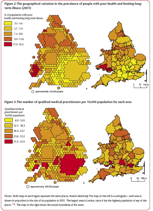 Geographical distribution of poor health and doctors in the UK. Source: JRF report: Life in Britain
Another report, Life in Britain, provided a geographical graph of the ‘inverse care law’. The authors use geographic data from the 2001 cencus to highlight that higher numbers of practising, qualified medical practitioners tend to live and work in areas where the rates of illness are lower.
In both figures, the cartograms on the left shows each area in proportion to its population in 2001. The largest area is London, as it has the highest population density. The right hand map shows the actual boundaries of the areas.
The authors comment on the graph that "perversely, people living in the poorest neighbourhoods with the greatest needs are often the least likely to have access to the services and support that would help them improve their lives." Given these results, the authors are not surprisingly very negative on their views of social equality in the UK today. Prof. Dorling said "it is acutely disappointing to discover that so many opportunities and resources still depend on where people live." And Dr Ben Wheeler, also from the University of Sheffield, said that "the census data shows quite clearly that although living standards have increased in 60 years, the rich and poor in Britain continue to live in two different worlds."
These graphs demonstrates the power of the Census to provide easily interpreted data that consider the entire population and make obvious the continued unequal distribution of resources and prospects in the UK today.
The authors advocate the use of simple quantitative methods throughout their work, the most complex being correlation coefficients. Typically, they use pairs of variables, derived from the Census data, are compared across the geographical areas, with most pairs representing one measure of need and one measure of availability. The objective is demonstrates associations rather than proving causes.
A related ‘inverse education law’ also appears to exist in the case of education. Areas which have the highest proportions of young people with no qualifications tend to have the fewest teachers available.
Further reading
Guardian Unlimited, Matt Weaver, September 1, 2005.
JRF report: poverty, affluence and area (pdf file), Dr Ben Wheeler and Professor Danny Dorling from the University of Sheffield, Dr Mary Shaw from the University of Bristol and Dr Richard Mitchell from the University of Edinburgh.
JRF report: Life in Britain A pack summarising the results of the analysis of the UK 2001 Census data was published by The Policy Press. It is intended for use by students, their teachers and a wide range of practitioners and policy makers, and consists of 10 short reports, a summary, a technical report and 5 A2 posters.Some parts of some Joseph Rowntree Foundation reports are available on-line and are well worth reading for background information on social policy and poverty. For example, Thomas Clarkson won a prize in 1785, while he was a student at Cambridge, for An essay on the impolicy of the African slave trade. His essay includes an analysis of the very high rates of mortality (20%) among seamen on board eighty-eight slave ships that returned to Liverpool from their respective voyages in September 1787. This analysis was intended to counter the then prevalent pro-slavery argument that slave trade provided a nusery for British seamen. He includes some chilling graphics on life for slaves on board as well. This essay provoked him to pursue the goal of the abolition of slavery. This link also provides a harrowing extract from his book, History of the abolition of the African slave trade, which was first published in 1817, in which he gives more details of conditions of the lives of slaves.
The same link also contains the more statistically orientated opening chapter from Richard Titmuss' 1943 book Birth, poverty and wealth. Titmuss used statistical data from many sources to show that premature death was most likely in the lowest occupational groups, least likely in the highest. Titmuss knew that the evidence did not allow him to be dogmatic about the relative importance of heredity and environment but he was still forceful in his conclusions
'The fact that for every eleven infants of the economically favoured groups who die from preventable causes, 90 children of the poor die from similar causes summarises, as a matter of life or death, the power of environment and economics.’
Its publication was greeted with the newspaper headline Poor folks' babies stand less chance.
Discussion
Do you think that a lack of doctors leads to areas with generally poor health, or are areas with generally poor health unattractive places for doctors to live causing them to relocate elsewhere?


