Chance News 110
Quotations
“When a coincidence seems amazing, that’s because the human mind isn’t wired to naturally comprehend probability and statistics.”
"They [new planet candidates] are fascinating, but Kepler’s mission is not to pinpoint the next tourist destination — it is to find out on average how far away such places are. Or, as Dr. Batalha said, We’re not stamp collecting, we’re doing statistics.”
Forsooth
“[Richard] Florida finds that this population [service workers] currently splits its vote evenly between the two parties — ‘no statistical significance for either Trump or Clinton.’ ”
Statistical artifacts
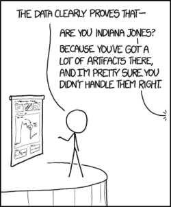
Artifacts
from XKCD

Suggested by Michelle Peterson
Crowd size
From Lincoln to Obama, how crowds at the capitol have been counted
by Tim Wallace, New York Times, 18 January 2017
This article anticipates the controversy that ensued from Trump's claims about the size of the crowd for his inauguration.
There is a nice historical retrospective here, starting with Lincoln's inauguration. Period photographs have now been studied using tools like Google Earth to give an estimate of 7350 attendees.
Controversy over crowd estimates is also nothing new. It's now been more than 20 years since Louis Farrakhan's Million Man March in 1995. His supporters threatened to sue the National Park Service for giving an estimate of only 400,000. In the aftermath, the Park Service stopped providing official estimates.
In Crowd estimates from Chance News 68, we described Glenn Beck's 2010 rally and event held in response by John Stewart and Stephen Colbert. A Washington Post story at the time gave an annotated graphic of the satellite photo analysis of Barack Obama's 2009 inaugural. The present NYT article notes that satellite analyses have become more common since that time.
The NYT also references a Scientifc American discussion, The simple math behind crunching the sizes of crowds. As their "Math Dude "Jason Marshall, says "I feel that it’s important to note that estimating crowd sizes is a solved problem that’s actually pretty straightforward."
Of course, when the estimate becomes a proxy for political support, things are not so straightforward. The 2017 inaugural has given us the phrase alternative facts!
Still thinking about the election
Margaret Cibes sent a link to the following:
- The 2016 national polls are looking less wrong after final election tallies
- by Scott Clement, Washington Post, 6 February 2017
Gender stereotypes
Nick Horton sent the following to the Isolated Statisticians list-serv:
Gender stereotypes about intellectual ability emerge early and influence children’s interests
by Lin Bian, Sarah-Jane Leslie, Andrei Cimpian, Science, 27 January 2017
The full article requires a subscription. From the summary on the web page we read:
The distribution of women and men across academic disciplines seems to be affected by perceptions of intellectual brilliance. Bian et al. studied young children to assess when those differential perceptions emerge. At age 5, children seemed not to differentiate between boys and girls in expectations of “really, really smart”—childhood's version of adult brilliance. But by age 6, girls were prepared to lump more boys into the “really, really smart” category and to steer themselves away from games intended for the “really, really smart.”
Nick recommended this study for use in class for a number of reasons, including the fact that available for download from the Open Science Framework, and the analyses are quite accessible with tools such as the t-test and the chi-squared test.
Here is a newspaper story about the study:
- Why young girls don’t think they are smart snough
- by Andrei Cimpian and Sarah-Jane Leslie, New York Times, 26 January 2017
Hans Rosling
Margaret Cibes sent a link to the following:
- Hans Rosling, Swedish doctor and pop-star statistician, dies at 68
- by Sam Roberts, New York Times, 9 February 2017
Gapminder Effect has been measured
Gaussian correlation inequality
Pete Schumer sent a link to the following:
- A long-sought proof, found and almost lost
- by Natalie Wolchover, Quanta, 28 March 2017
paper can be found here. Blog discussion here.
Spotting bad statistics
Priscilla Bremser recommended the following TED talk:
- 3 ways to spot a bad statistic, by Mona Chalabi
Flint water crisis
Q&A: Using Google search data to study public interest in the Flint water crisis
by John Gramlick, Pew Research Center, 27 April 2017.
The murky tale of Flint's deceptive water data
by Robert Langkjær-Bain, Significance, 5 April 2017
What went wrong In Flint
by Anna Maria Barry-Jester, FiveThirtyEight, 26 January 2016
Same stats (think Anscombe)
Jeff Witmer sent the following link to the Isolated Statisticians list.
- Same stats, different graphs: Generating datasets with varied appearance and identical statistics through simulated annealing
- by Justin Matejka, ACM SIGCHI Conference on Human Factors in Computing Systems
Observing that it is not known how Frank Anscombe went about creating his famous quartet of scatterplots, the authors present the results of their simulated annealing technique to produce some striking visualizations. Worth a look just to see their Datasaurus Dozen, which even has an R data package.
The fivethirtyeight package for R
fivethirtyeight Package
by Albert Y. Kim, Chester Ismay, and Jennifer Chunn, announced 13 March 2017
The authors have developed a package for pedagogical use that provides data and R code corresponding to analyses presented at FiveThirtyEight.com. Their goal is to allow students to get into the data with minimal overhead.
This should be a very valuable resource for teaching about statistics in the news! Here is a quick illustration of how to use the package. More details are available in the package vignette linked above.
Debate over white mortality
Stop saying white mortality Is rising
by Jonathan Auerbach and Andrew Gelman, Slate, 28 March 2017
The forces driving middle-aged white people's 'deaths Of despair'
by Jessica Boddy, NPR Morning Edition, 23 March 2017
Interracial marriage
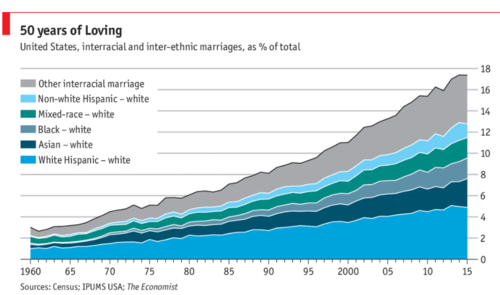
Peter Doyle sent a link to this chart from the Economist:
- Daily chart: Interracial marriages are rising in America
- Economist, 12 June 2017
 ,
,Quoting from the article, one reader commented:
"Of the roughly 400,000 interracial weddings in 2015, 82% involved a white spouse, even though whites account for just 65% of America’s adult population. " If you lump the population into just two groups A and B, 100% of intergroup marriages will involve a spouse from group A, no matter what fraction of the population belongs to group A.
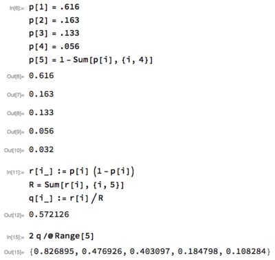
Exercise: 2015 census data is available by googling "us census quickfacts". While the categories don't precisely match those in this piece, you can use this data to get a rough estimate the fraction of interracial weddings that would involve a white spouse under random pairing. What do you get? Is your answer more or less than 82%?
Peter notes that he got just over 82%. Here is his solution (using Mathematica):
