Chance News 102: Difference between revisions
No edit summary |
|||
| Line 1: | Line 1: | ||
October 14, 2014 to December 31, 2014 | |||
==Quotations== | ==Quotations== | ||
"Collecting data [http://www.nytimes.com/2014/11/22/upshot/oregon-health-study-the-surprises-in-a-randomized-trial.html?abt=0002&abg=1 that can trump a powerful anecdote] is the value of the randomized controlled trial, says Amy Finkelstein, an M.I.T. professor and a leader of the Oregon study, which has published [http://www.nber.org/oregon/ a series of papers], most recently [http://www.sciencemag.org/content/343/6168/263.abstract on emergency room use]." | "Collecting data [http://www.nytimes.com/2014/11/22/upshot/oregon-health-study-the-surprises-in-a-randomized-trial.html?abt=0002&abg=1 that can trump a powerful anecdote] is the value of the randomized controlled trial, says Amy Finkelstein, an M.I.T. professor and a leader of the Oregon study, which has published [http://www.nber.org/oregon/ a series of papers], most recently [http://www.sciencemag.org/content/343/6168/263.abstract on emergency room use]." | ||
Revision as of 01:43, 13 January 2015
October 14, 2014 to December 31, 2014
Quotations
"Collecting data that can trump a powerful anecdote is the value of the randomized controlled trial, says Amy Finkelstein, an M.I.T. professor and a leader of the Oregon study, which has published a series of papers, most recently on emergency room use."
in: How to arrive at the best health policies, "The Upshot" blog, New York Times, 21 November 2014
Submitted by Paul Alper
“Animals are terrible survey respondents.”
New York Times, 5 November 2014
More on Auerbach's study below.
Submitted by Bill Peterson
“To achieve the goal of making our children happier, this ‘finding’ has led to the suggestion that academic standards should be relaxed. The existence of this suggestion and that it is being seriously considered lifts the subject of the direction of the causal arrow (as well as the size of the causal effect) out of the realm of the theoretical into that of the immediately practical.
This notion falls into the category of ‘rapid idea.’ Rapid ideas are those that only make sense if you say them fast.”
“.... You can feel the authors’ desire to be causal, and they come very close to making a causal claim .... But the character of the published studies mitigates against the sorts of causal interpretations that seem to be yearned for. Most were observational studies, and the rest might be called ‘some data I found lying in the street.’”
“There are a lot of theories about why vaccine denialism is such a problem …, and one of the most persuasive is the master-of-the-universe phenomenon. The wealthier you are and the higher your education level, the more you lose sight of the randomness of misfortune and come to believe you can control variables and eliminate risk.”
“In the dry but appallingly eloquent language of statistics, the historians explain to us that, in eighteenth-century French villages, the median age of marriage was higher than the median age of death.”
“The big data craze threatens to be The Literary Digest all over again. Because found data sets are so messy, it can be hard to figure out what biases lurk inside them – and because they are so large, some analysts seem to have decided the sampling problem isn’t worth worrying about. It is.
“Professor Viktor Mayer-Schönberger of Oxford’s Internet Institute ... told me that his favoured definition of a big dataset is one where ‘N = All’ – where we no longer have to sample, but we have the entire background population. .... But is ‘N = All' really a good description of most of the found data sets .... Probably not. .... An example is Twitter. .... According to the Pew Research Internet Project, in 2013, US-based Twitter users were disproportionately young, urban or suburban, and black.”
(originally published in the Financial Times)
“Best, Smith, and Stubbs (2001)[1] found a positive relationship between perceived scientific hardness of psychology journals and the proportion of area devoted to graphs. It is interesting that Smith et al. (2002)[2] found an inverse relationship between area devoted to tables and perceived scientific hardness.”
Submitted by Margaret Cibes
Forsooth
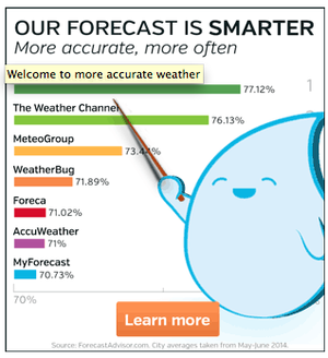
Alas, the graph is not smarter:

The nonzero baseline (note the 70% label fading into the background here) is of course a familiar trick for exaggerating comparisons, and examples abound. It just feels worse in a claim about scientific accuracy!
Submitted by Bill Peterson
"There’s still time to vote, but with forecasters giving Republicans anywhere from a 75% to 113% chance of capturing a Senate majority, it isn’t too early to explain the result."
Submitted by Emil M Friedman
"Our investigation of government spending in the 24 states that dedicate lottery funds for education yields a stunningly bad report card: the percentage of state spending on education is down or flat in 21 of those states from coast to coast. Lotteries provide no additional funding for education in 21 out of 24 states. As math students in one of those places would put it, that is nearly 50%."
Submitted by Margaret Cibes
"The 2012 agriculture appropriations bill that the … Committee approved … includes large cuts in [the WIC program]. …. One of the … justifications … is its claim that over 40 percent of WIC expenditures go for program administration. …. In coming up with the 40 percent figure, the Committee apparently misunderstood a finding in a USDA report that for every $1 in federal WIC funds spent for WIC foods in 2006, 41 cents in federal funds went for administrative costs plus WIC nutrition services. The Committee evidently used this statement to come up with its assertion … that ‘administrative costs of operating WIC are well above 40 percent.’ But 41 cents out of $1.41 in expenditures equals 29 percent, not 41 percent ….” (original emphasis)
Submitted by Margaret Cibes
Ebola quanrantines
How to quarantine against Ebola
by Siddartha Mukherjee, New York Times, 12 October 2014
This op-ed piece dismisses several strategies for containing entry and spread of Ebola in the U.S. in favor of blood-sample screening based on multiplying any genes of the virus present via PCR (polymerase chain reaction).
Author Mukherjee (a professor of medicine at Columbia University) cites a false-positive rate of 3 per thousand and a false-negative rate of 4 per thousand.
Discussion
1. If an average of one person per planeload of 200 people has contracted the Ebola virus, what is the ratio of false positives to true positives in screening such planeloads?
2. If one in 1,000 people screened has the Ebola virus, what is the ratio of false positives to true positives?
3. If one in 10,000 people screened has the Ebola virus, what is the ratio of false positives to true positives?
4. Dr. Mukherjee cites a 2000 study in The Lancet of 24 "asymptomatic" individuals who had been exposed to Ebola. They were tested for the Ebola virus using an earlier version of the proposed screening test. Of the 24:
- 11 developed Ebola, 7 of whom had had positive tests;
- 13 did not develop Ebola, and none of them had tested positive.
From these data, how would you estimate the false-positive rate and false-negative s (with appropriate measures of uncertainty)? (The rates 3/1000 and 4/1000 cited above are for a later version of the method as refined in 2004.)
Submitted by Paul Campbell
Interpreting election forecasts
How not to be fooled by odds
by David Leonhardt, "The Upshot" blog, New York Times, 15 October 2014
Will the midterm elections result in Republican control of the Senate? The latest Upshot forecast gives a 74% chance. Leonhardt observes that the person in the street might interpret this a virtual lock. Nevertheless, he says that people do understand the statement that the chance of rolling a sum of eight or lower with two dice is about 74%: this is a better than even chance, but not a lock. Or, via the complement (26% chance) it is possible to get a sum exceeding eight.
For reference, he gives a list of situations that correspond to the 26% figure. Among these:
- The chances that a blackjack casino dealer busts
- The frequency with which a 25-year-old woman is shorter than 5 feet 3 inches
- The share of Americans who live in California, Texas or New York
Discussion
1. Do you think people misinterpret a 74% win probability as meaning that Republicans are predicted to get 74% of the vote? (The latter would be a landslide victory!)
2. (Chance News reader) Emil Friedman commented that the article "may add to students' confusion. Several of his examples merely state the proportion of something in a population. To turn them into probability statements would require changing the wording to read something like The probability that a randomly chosen woman will be shorter than 5 feet 3 inches."
Followup: Prediction markets
Republicans are surging in the prediction markets
by Justin Wolfers, "The Upshot" blog, New York Times, 15 October 2014
Wolfers writes, "Is there now a clear leader in the race for control of the Senate? I think so, but it really depends on whether you’re listening to the polls or the prediction markets." The surge he refers to is in the Betfair, where chances for Republicans taking the Senate have risen from 69% on October 10 to 86% on October 24. Wolfers adds parenthetically that "The Betfair odds for victory by the Democrats should be ignored, as the bet offered requires that they win without relying on the votes of the two independent senators who typically caucus with them."
Discussion
If this bet is indeed uninformative, do you think its presence on the site might affect overall betting trends?
Submitted by Bill Peterson
Rats! NYC capture-capture experiment
“Does New York City really have as many rats as people?”, Significance, October 2014
“New Analysis Reassesses Size of New York’s Rat Population”, Wall Street Journal, November 14, 2014
Jonathan Auerbach, Columbia doctoral student in statistics, has written an interesting report about a capture-recapture experiment he conducted to estimate the size of NYC’s rat population. For his article, he won first prize in the YSS/Significance Young Statisticians Writing Competition. Interested readers can find his report in Significance magazine, or they can find a briefer summary of his experiment in the Wall Street Journal.
Auerbach’s methodology is quite interesting because he did not actually capture any rats:
NYC’s Department of Health and Mental Hygiene [would have been] unlikely to approve a large-scale rat-releasing experiment (I know; because I asked).
Using the capture-re-capture process, he selected geographical locations (city lots), “marked” them, collected data about rat sightings as reported to the city in the first half of 2010, and then compared that data to analogous data in the first half of 2011. He includes in his report all of his assumptions and his own analysis of his assumptions, as well as information about rats.
Submitted by Margaret Cibes
Supply and demand of old magazines
An exploration of the basis for patient complaints about the oldness of magazines in practice waiting rooms: cohort study
by Bruce Arroll, Stowe Alrutz and Simon Moyes, BMJ, 14 December 2014
The BMJ's December issue is famous for this sort of spoof. In the abstract, we read:
Results 47 of the 82 magazines with a visible date on the front cover were aged less than 2 months. 28 of these 47 (60%) magazines and 10 of the 35 (29%) older magazines disappeared (P=0.002). After 31 days, 41 of the 87 (47%, 95% confidence interval 37% to 58%) magazines had disappeared. None of the 19 non-gossipy magazines (the Economist and Time magazine) had disappeared compared with 26 of the 27 (96%) gossipy magazines (P<0.001). All 15 of the most gossipy magazines and all 19 of the non-gossipy magazines had disappeared by 31 days. The study was terminated at this point.
Conclusions General practice waiting rooms contain mainly old magazines. This phenomenon relates to the disappearance of the magazines rather than to the supply of old ones. Gossipy magazines were more likely to disappear than non-gossipy ones. On the grounds of cost we advise practices to supply old copies of non-gossipy magazines. A waiting room science curriculum is urgently needed.
Submitted by Paul Alper
Darrell Huff book banned
“Stats book banned over ‘misperceptions’”, Significance, December 2014
“Training book used for VA: ‘How to Lie with Statistics’”
The Arizona Republic, September 26, 2014
After a House committee hearing, the U.S. Department of Veterans Affairs Secretary ordered the department to discontinue using the 1954 Huff book, How to Lie with Statistics in its training materials. See a short video here.
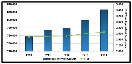
A committee member claimed that the department had “employed one of the misleading techniques discussed in the book.” He referred to the chart below, which he claimed indicated a “purposeful intent to deceive Congress and the American people.” He also claimed that, if the department had used the same scale on both vertical axes, the growth in the number of FTEs and outpatients would have been approximately the same, and not so different as the chart made it appear.

Professor Andrew Gelman, of Columbia University, commented:
The book is an entertaining series of examples. ... It's not any kind of statistical manual. It's a book that people give to students to read to serve as an entertaining example of how to be careful when you're presenting data.
Readers may wish to compare the percent increases to see if they, the readers, agree or disagree with the Congressman.
Submitted by Margaret Cibes
Historical graphic on marriage
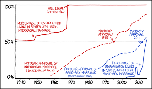
The following is a cartoon from XKCD. It shows the contrast between interracial marriage, which was legal long before majority opinion approved of it, and same-sex marriage, for which approval has preceded legalization.
The cartoon is reproduced on Andrew Gelman's blog (November 28, 2014) in a post entitled Quantitative literacy is tough! Or, I had no idea that, in 1958, 96% of Americans disapproved of interracial marriage!
Gelman writes
And I was stunned, first by the data on interracial marriage and then, retrospectively, by my earlier ignorance of these data. Was approval of interracial marriage only 4% in 1958? I had no idea. I looked it up at the Gallup site and it seems to be so. But it’s just hard for me to get my head around this. I mean, sure, I know that attitudes on racial issues have changed a lot, but still . . . 4 percent?? If you’d’ve asked me, I might have guessed 30 percent, or 20 percent, certainly I never would’ve given any number close to 4 percent.
In some ways that second number (the total percentage of marriages that are between blacks and whites) is somewhat of a trick question. Still, I’m surprised how far off my intuition was on both these numbers (the rate of approval of interracial marriage in 1958, and the current percentage of marriages that are between whites and blacks). Indeed, I still can’t fit the 1958 approval number into my understanding of public opinion.
The comments section also contains some interesting posts.
Submitted by Paul Alper
(Note. XKCD often features cartoons with statistical themes. We have just discovered a parallel Wiki devoted to explanations of the cartoons. Here is the entry for the marriage cartoon.)
Old Vegas slot machine finally pays off
In Chance News 98, there was mention of a 20-year-old Vegas slot machine that hadn't "produced a jackpot in nearly two decades."
On January 9, 2015, the Daily Mail reported that two New Hampshire grandparents had won the $2.4 million jackpot after five minutes of $3 hits.
A blogger commented,"Just think how many people put millions of dollars in that bandit." Another asks, "[H]ow much has this couple LOST gambling over the years?"
Submitted by Margaret Cibes
Significance re overlapping confidence intervals
For a simple example of a statistically significant difference between two variables with overlapping confidence intervals, see “Overlapping Confidence Intervals and Statistical Significance”, Cornell Statistical Consulting Unit, 2008.
For details of an experiment about common misperceptions about overlapping confidence intervals, see “Researchers Misunderstand Confidence Intervals and Standard Error Bars”, by Sandra Belia et al., Psychological Methods, 2005.
Submitted by Margaret Cibes
Gini coefficient for air travel
Peter Doyle sent a link to the following:
- Modern flying: a triumph in socialism
- Economist, 4 December 2014
The article poses the question "Is a commercial jumbo jet a more or a less equal place to be than America?" In a blog post, SUNY Albany sociologist Beth Berman suggested computing the Gini coefficient for the amount of space allocated to higher class passengers relative to their numbers. According to Berman
...in today’s standard U.S. domestic configuration, the 12% of people in first class use about 25% of the passenger space, the 51 people in Economy Plus use another 30%, leaving the sardines—the other 157 people—with 45%. That gives us a Gini index of about 16.
The article reports that the US Gini coefficient for income is 41, making the airline's allocation of space more egalitarian. Even the new Boeing 777, whose luxury accommodations include horizontal air beds, has a coefficient of only 25.
In a related blog post entitled Fly Air Gini, Duke sociologist Kieran Healy produced graphics depicting what things would look where space was allocated to match (income) Gini coefficient.
Overdiagnosing ADHD
The post Can you get fired over the wording of a questionnaire? (Chance News July-August 2005) described the case of Dr. Gretchen LeFever, a clinical psychologist whose survey work raised questions about the apparent over-diganosis and over-treatment of ADHD (attention deficit hyperactivity disorder) in children. Her work was sharply criticized by other researchers with ties to pharmaceutical companies, and she was subject to an anonymous charge of scientific misconduct based on the wording of her questionnaire.
Dr. (LeFever) Watson recently wrote with a link to the foliowing paper, which chronicles the history of the controversy over the last decade.
- Shooting the messenger: The case of ADHD
- by Gretchen LeFever Watson, et. al., Journal of Contemporary Psychothererapy, 2014; 44(1): 43–52.
This is a detailed narrative full of twists and turns, well worth reading as a story about what can happen when scientific investigation clashes with commercial interests. Dr. Watson was ultimately cleared of the misconduct charge. Nevertheless, pharmaceutical companies have successfully deflected criticism and promoted the wider use of drugs like Ritalin, even for adults. The paper concludes that "The rate of ADHD diagnosis now exceeds all reasonable estimates of the true prevalence of the disorder. As a consequence, ADHD drugs are readily available on American high school and college campuses where they are increasingly abused with serious and sometimes lethal consequences."
Regarding this last point, see also the following news story.
- The selling of attention deficit disorder
- by Alan Schwarz, New York Times, 14 December 2013
According to the article, "Few dispute that classic A.D.H.D., historically estimated to affect 5 percent of children, is a legitimate disability that impedes success at school, work and personal life." However, "recent data from the Centers for Disease Control and Prevention show that the diagnosis had been made in 15 percent of high school-age children, and that the number of children on medication for the disorder had soared to 3.5 million from 600,000 in 1990."
The article quotes Dr. Keith Conners, a early pioneer in treating ADHD, who laments the current state of affairs: “The numbers make it look like an epidemic. Well, it’s not. It’s preposterous. This is a concoction to justify the giving out of medication at unprecedented and unjustifiable levels.”
Submitted by Bill Peterson
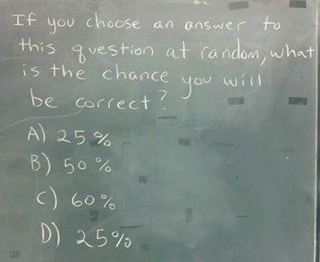
Comic relief for exam week
Frank Swenton sent the following cartoon from CHEEZburger.com:

