Student’s version


Student directions:
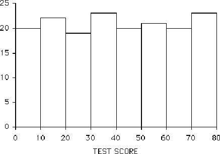
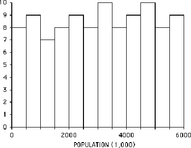
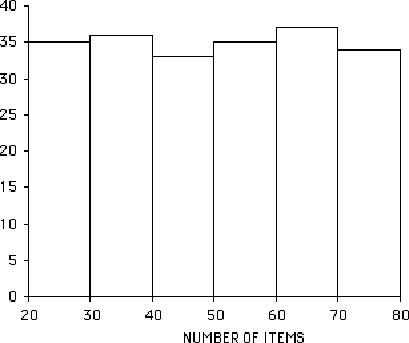
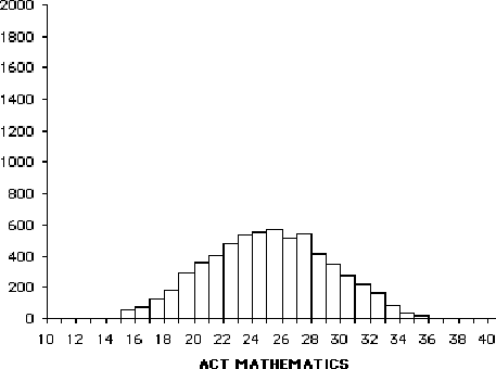
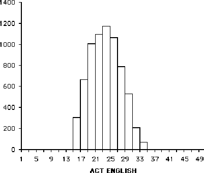
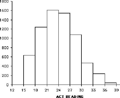
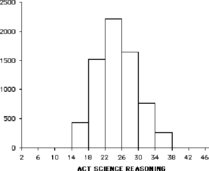
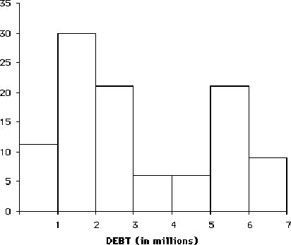
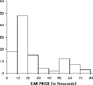
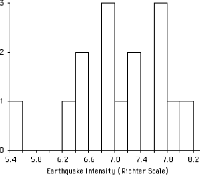
Your small group will be given a stack of different graphs, representing different data sets. The type of data being measured is indicated on the horizontal axis, and the vertical axis represent now many are in each bar (or category). Working together as a group, sort the stack of graphs you are given into piles, according to those that look the same or similar.
Once you have agreed upon the groups, discuss and write down answers to the following:
1. Describe what’s similar about the graphs in each group.
2. Pick one graph in each group that is the best example of that group.
3. Give the group a name that you think describes the general shape.
4. If there are graphs that don’t fit in a group, try to determine why it was impossible to place them in a group. What is different or confusing about them?
Follow-up questions for students (after class discussion of activity)
What would these
graphs look like? (use statistical terms to describe them)
1. The salaries of all persons employed at the University of Minnesota.
2. The grades on an easy test.
3. The grades on a difficult test.
4. The amount of times freshmen students study the first week of class.
5. The age of cars on a used-car lot.
6. The amount of time spent by students on a difficult test (maximum time allowed is 50 minutes.)
7. The heights of students in the U of M band.